


Overview
There is no denying that recently the rate of crime has increased not only on women also on children. Currently, people struggle because they feel unsafe in some settings, especially when they are alone.
Ameigo was initially thought of to be a safety app, kind of like a more productive version of Find My Friends. We quickly realized that this application would be helpful in emergency situations as well as normal day to day experiences.
We wondered “What if in one click you could instantly feel safer when checking in with your loved ones?”
My Role:
-
UX Designer
-
Visual Designer
-
Information Architect
-
User Researcher
Responsibilities included:
-
Primary and secondary research
-
Creating personas, workflows, epics, and user stories
-
Organized and structured the information in the app to streamline the user experience
-
Created the initial and refined the visual components of the app
-
Creating and maintaining style guides
-
User and competitor research
-
Low-fidelity wireframes and prototypes
-
High-fidelity designs and asset creation
-
Design workflow management
Research:
Lean Canvas:
At the beginning of our project, our team leader gathered the stakeholders to quickly fill out the lean canvas to look at the many different perspectives around GPS tracking in mobile devices. The Lean Canvas provided the initial alignment for the Ameigo app.
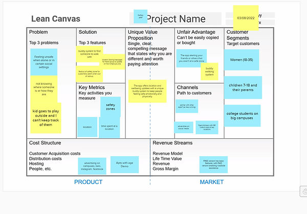
Key Findings:
-
The biggest opportunity a more community-based “proactive” app with auto alerts, instead of the standard reactive
Feature-Based Competitive Analysis:
After getting a grasp of who our primary user I researched the features that competitors are offering and gaps with their current programs. Everyone on the team downloaded and overviewed 2 different programs and come back to our project manager with results. We compared and contrasted features to address most of the gaps.

Positive Findings:
-
All of the competitors offered some way to share your location with individuals also using the app.
-
Most of the tools allowed users to “Check_in” with other individuals and send SOS messages to first responders
-
All users allowed for Admin users when there we minors using the App.
Gaps from Competitors:
-
Most of the competitors offered no instruction to users on how to share their location or request it from others.
-
There were no features to group individuals and save them as a group so they could all be alerted at once.
-
Most competitors offered location sharing and notifications as a base or 10% of their programming. With that no longer the main focus, other things were suggested and got in the way of the initial action, such as roadside services and tracking app usage on minors' devices.
Empathy Maps:
The team then built an Empathy Map to better understand our primary user and their concerns about their safety and the safety of their loved ones. The Empathy Map helped Ameigo Stakeholders to articulate what we know about a the users of our app. It helped us create a shared understanding of user needs and aid in decision making.

Affinity Diagram of Primary User:
The Affinity Diagram allowed the stakeholders and I to confirm our theory about overall feelings of loneliness and unsafety as being a major opportunity for our project.

Key Findings:
-
Users are worried about their friends and family when they know that they are out at night
-
Users feel unsafe at night while they are alone in public in social and regular settings (parking lots, bars, their nightly jog, etc.)
-
Users would feel better if they had help with roadside assistance when they are alone.
User Interviews:
As a User Researcher, after getting initial alignment in the empathy map, I performed user interviews to understand the wants and needs of Ameigo users.
In those interviews:
-
I wrote a discussion guide for interviewing.
-
I interviewed 4 potential Ameigo customers.
-
I compiled findings to be used for research-based personas.
Key Findings:
-
Young adult users wanted to see/spot their friends in the current vicinity using AR/VR technology.
-
Parent users wanted to know where their children were and set a milage or time/curfew radius for them.
-
Adult users wanted a way to share a destination with their friends and family, to help navigate them safely, and track them along the way.
User Personas:
After completing the user interviews, I built User Personas to personify the research gathered in the team and my user interviews. We developed three user personals to identify our core users. With these extreme users in mind, we went forward in our process, knowing whom we were designing for and their perspective needs.


DESIGN:
Epic and User Stories:
After completing the project's research phase, I wrote epics and user stories to shape the product's direction and helped identify the user's needs. Three main themes emerged:

-
Sharing your location
-
As a user, I want the ability to share and stop sharing my current location.
-
As a user, the ability to see friends or family within a walkable area (arena/park/event space).
-
As an admin user, I want to add a mile radius for a junior user.
-
-
Sending and receiving alerts
-
As a user, I want to be able to send pre-set messages and alerts to members of a safety group.
-
As a user, I want to receive alerts about traffic, so I know when to leave a location.
-
As a junior user, I want to be alerted when I come close to my mile radius or my curfew is close.
-
-
Creating "safety groups"
-
As a user, I want to be able to invite people from my phone contacts, Gmail, and Facebook account.
-
As a user, I want to be able to classify "name" sets of contacts as a safety group.
-
As a user, I want to control the safety groups I create and be able to "lock" a group or allow for changes with the group members.
-
User Workflows:
To begin designing, we create user flows for the first time and return users of Ameigo for each of our user profiles. User workflows helped further the platform layout to ensure usability and available features are easy to get to depending on where you are and what you're doing on the app.
As the UX Designer on this project, I start with a user workflow with the stakeholders to:
-
Explore possibilities and processes without going into visual design.
-
Optimize the workflow, identify gaps, and find new opportunities.
-
Determine the user interface based on the final workflow.
User Workflow 1: First-time User (Parent)
The First-time User has a slightly different workflow than the Returning User. Shown below is the final workflow developed for a First-time User.

User Workflow 2: (Parent) Returning User in Crisis Situation
-
This Returning User has a compressed workflow because they already have a user profile, safety groups, and safe spaces. Below is the workflow developed for a Returning User in a Crisis Situation.

Mobile App | UX Sketching:
Since there are several parts to the app, I decided to break it into sections based on the sitemap created in the same order as how users would be onboarded. These parts allowed the team to work cross collaboratively in an efficient manner where I passed down my completed sections.

Key Findings:
-
We needed a centralized menu to help a user navigate throughout the entire app quickly
-
We needed to add accordion features to the Safety Groups and Safe Spaces pages to reduce scroll fatigue.
-
Our augmented reality (AR) map could include user input in the navigation, similar to Waze.
Mobile App | Wireframes (Low Fidelity):
After completing the UX sketches, I created low-fidelity wireframes. As a UX Designer, I used low-fidelity wireframes to collaborate with my stakeholders to get alignment and feedback quickly.

Key Findings:
-
Easier to determine gaps without committing to a complete design.
-
Easier to explore different opportunities.
-
Something that could be tested with users as a representation without committing as much time to a final design.
Mobile App | Review of Workflows:
After building out the low-fidelity wireframes in Adobe Xd, I reviewed the workflow with the key stakeholders. I collaborated with another team member to make the prototype.

Overall Key Findings:
-
It was easy to see where there were gaps in the design.
-
I could determine 3 critical gaps in the workflows with stakeholders.
-
I was able to use the wireframes to make interactive prototypes.
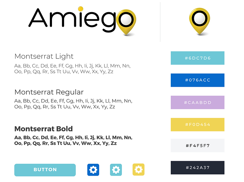
Branding:
I worked with stakeholders using a mood board to establish the branding elements for the product.
Key Branding Decisions:
-
We wanted a design that felt calm and safe to help soothe the user during stressful times when the app is used.
-
We needed one standout color of contrast to help users identify navigation and menu buttons
-
The brand needed to stand out in the market

Design System:
I worked with the stakeholders to create the design system. The Ameigo app has a clean look and feel with the typeface Montserrat.
Usability Testing
After creating a clickable prototype, the team validated the product design with several users and made changes. We tested the prototype on 9 potential users (teens, parents, and young adults) to get enough feedback to implement it in the second round of iterations.
Usability Test Findings:
We tested with 9 users and found critical issues with the current prototype, which I was able to address quickly.
Key Usability Findings:
-
Users didn't know where to go or what to do when they landed on the "profile" page after signing in
-
Users didn't intuitively know what to do next after completing one step of the process
-
For parents adding jr. ameigos, that setup process was too cumbersome
9 Interviews
7 Usability Tests
3 Major Findings
Updates to the Prototype:
Update 1: Change the Home screen
We changed the home screen from the profile to a location page and added a short app walkthrough for first-time users.
OLD

NEW

Update 2: Mini Tutorials throughout the app
We added actionable screen titles with prompts to every page and included next and finish buttons.
OLD

NEW

Update 3: Adding "jr. ameigos"
-
We created an invite code link and message for users to share for their friends to sign up quickly.
-
When any user added their age, anyone under 18 would immediately be labeled a "jr. ameigo."
OLD

NEW

Next Steps:
The amiego app received positive feedback from users and stakeholders. The current design has room for improvement before being implemented.

Immediate Next Steps:
-
Further, build the AR Navigation Feature
-
Continue to test for feedback and iterate on the design
-
Determine any interest from investors
Future Next Steps:
Collaborate with local businesses and organizations to create public "safe spots" and alert codes for use with the app.